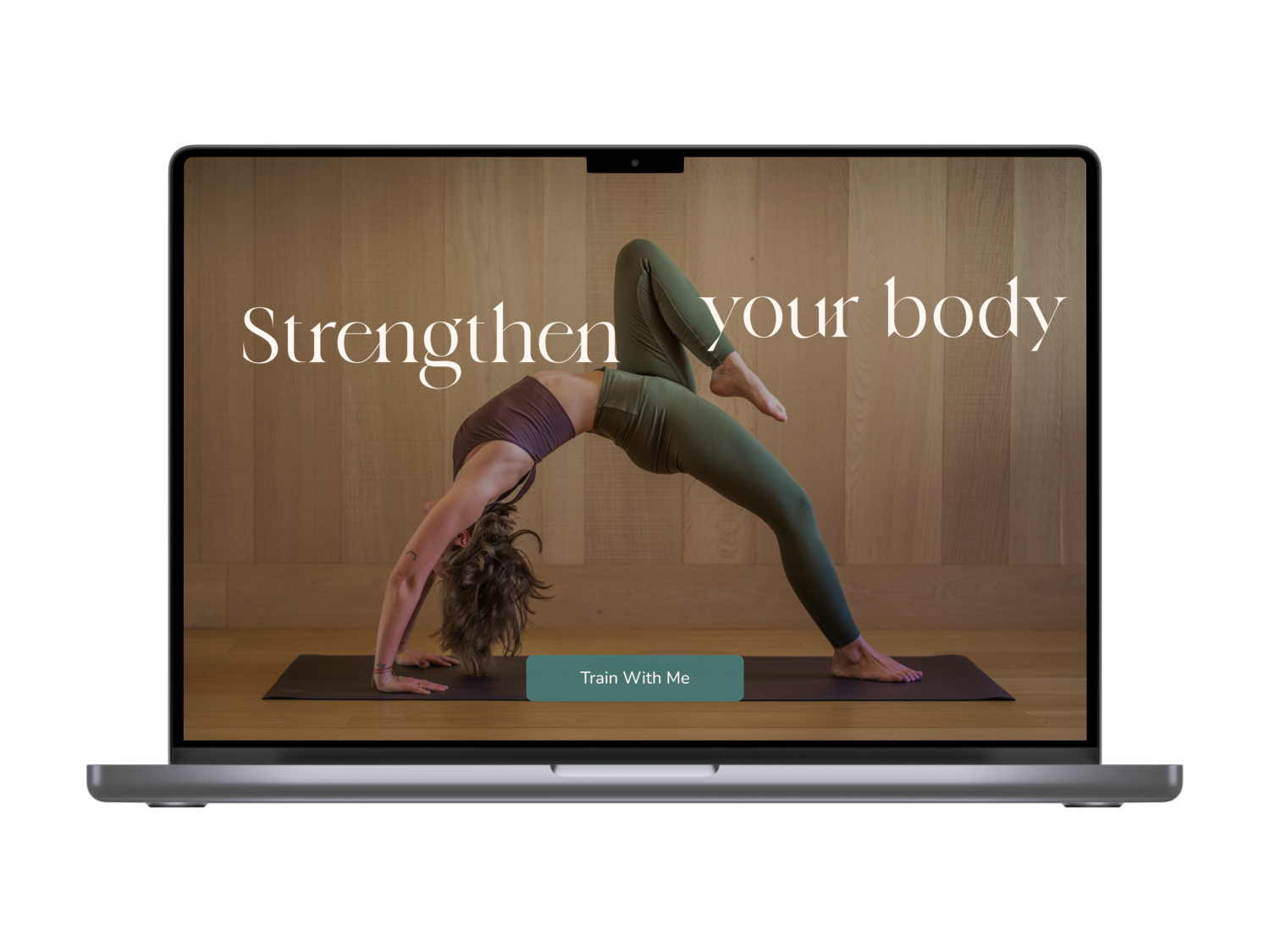
Empowering Fitness Journeys: Crafting a Landing Page for a Multifaceted Movement Expert
In the realm of health and wellness, our client, a highly skilled professional dancer and certified Pilates and Yoga teacher, has emerged as a beacon of inspiration.
With a profound dedication to promoting a healthy lifestyle, she embarked on a mission to create a captivating landing page that would not only inform potential clients about her expertise but also provide a seamless booking platform for her diverse range of training styles.
Let’s dive into the process of designing and developing a purpose-driven landing page that empowers visitors to explore her offerings, book classes, and embark on transformative fitness journeys.
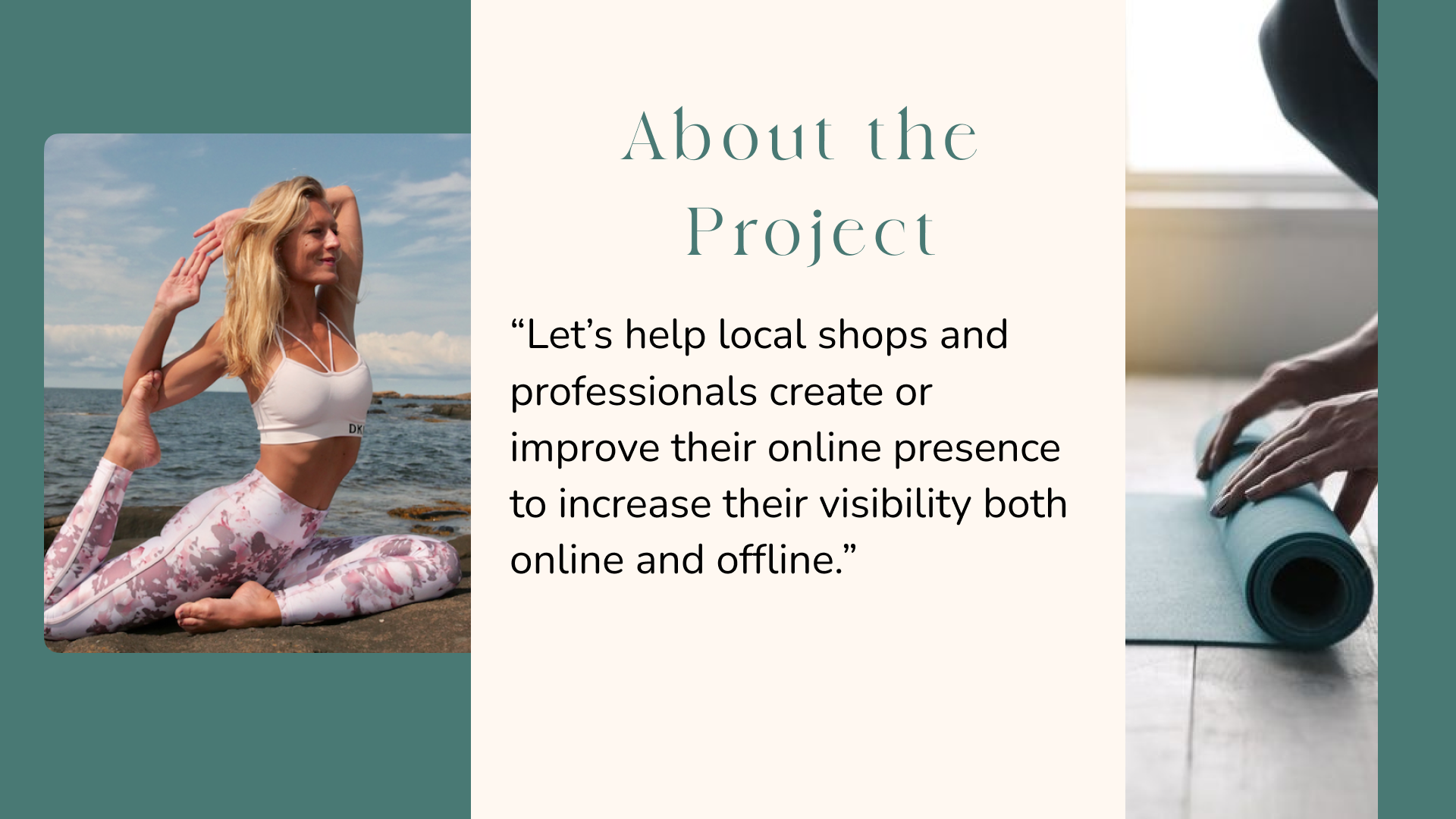
Our Team Behind behind ourUX/UI Project at Ironack
Our team for this project at Ironack was comprised of a dynamic and talented quartet: Sandra, Flo, Lucius, and myself. Each team member brought a unique set of skills and perspectives to the table, fostering a collaborative and innovative environment. Together, we embarked on a remarkable journey, leveraging our individual expertise to create outstanding UX/UI solutions.
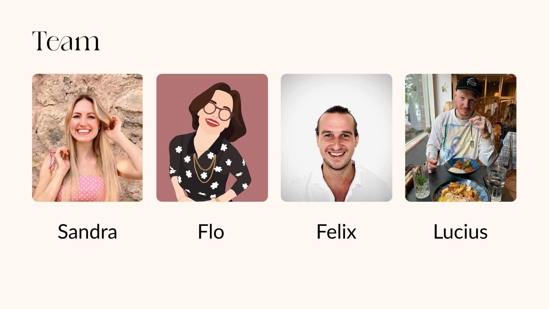
Collaborating with Body Unity to Create a Clean and Simple Website
Let me introduce you to our esteemed stakeholder, Maja from Body Unity.
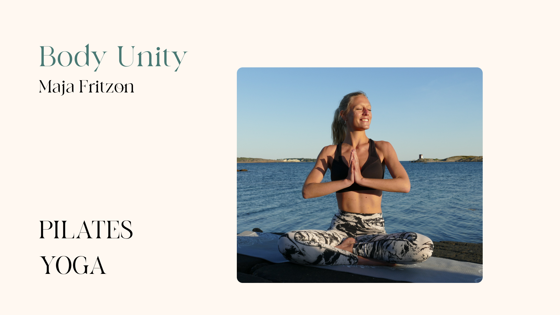
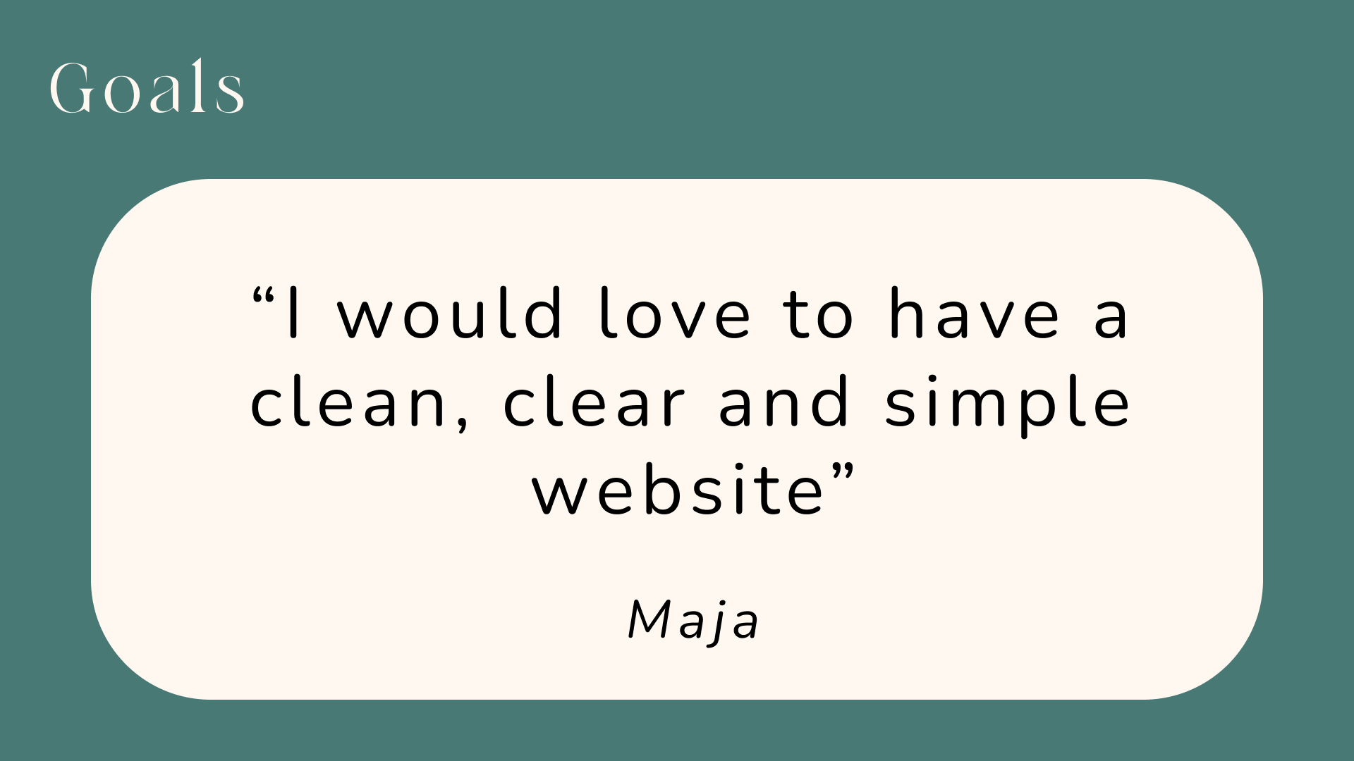
As the owner of a pilates and yoga studio, Maja expressed her aspiration for a clean, clear, and simple website. With our team’s combined UX/UI skills and expertise, we embarked on a mission to help Maja achieve her goal.
Our collaboration with Body Unity aimed to leverage our design prowess to create a website that not only reflects the essence of her studio but also provides a seamless and delightful user experience.
Our collaboration with Body Unity aimed to leverage our design prowess to create a website that not only reflects the essence of her studio but also provides a seamless and delightful user experience.
Insights from User Interviews
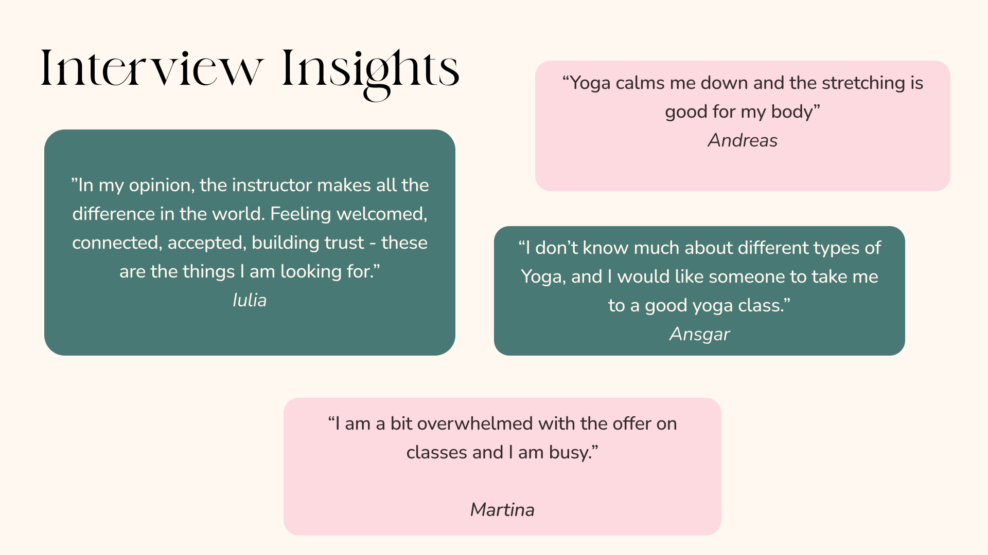
After establishing our collaboration with Body Unity, we dived straight into the user research phase. Recognizing the importance of understanding our target audience, we conducted a series of interviews to gather valuable insights.
Through these interviews, we had the opportunity to engage with a diverse group of individuals who were potential users of Body Unity’s website. Their perspectives and feedback provided us with invaluable information to shape our design decisions.
Through these interviews, we had the opportunity to engage with a diverse group of individuals who were potential users of Body Unity’s website. Their perspectives and feedback provided us with invaluable information to shape our design decisions.
Affinity Diagramm
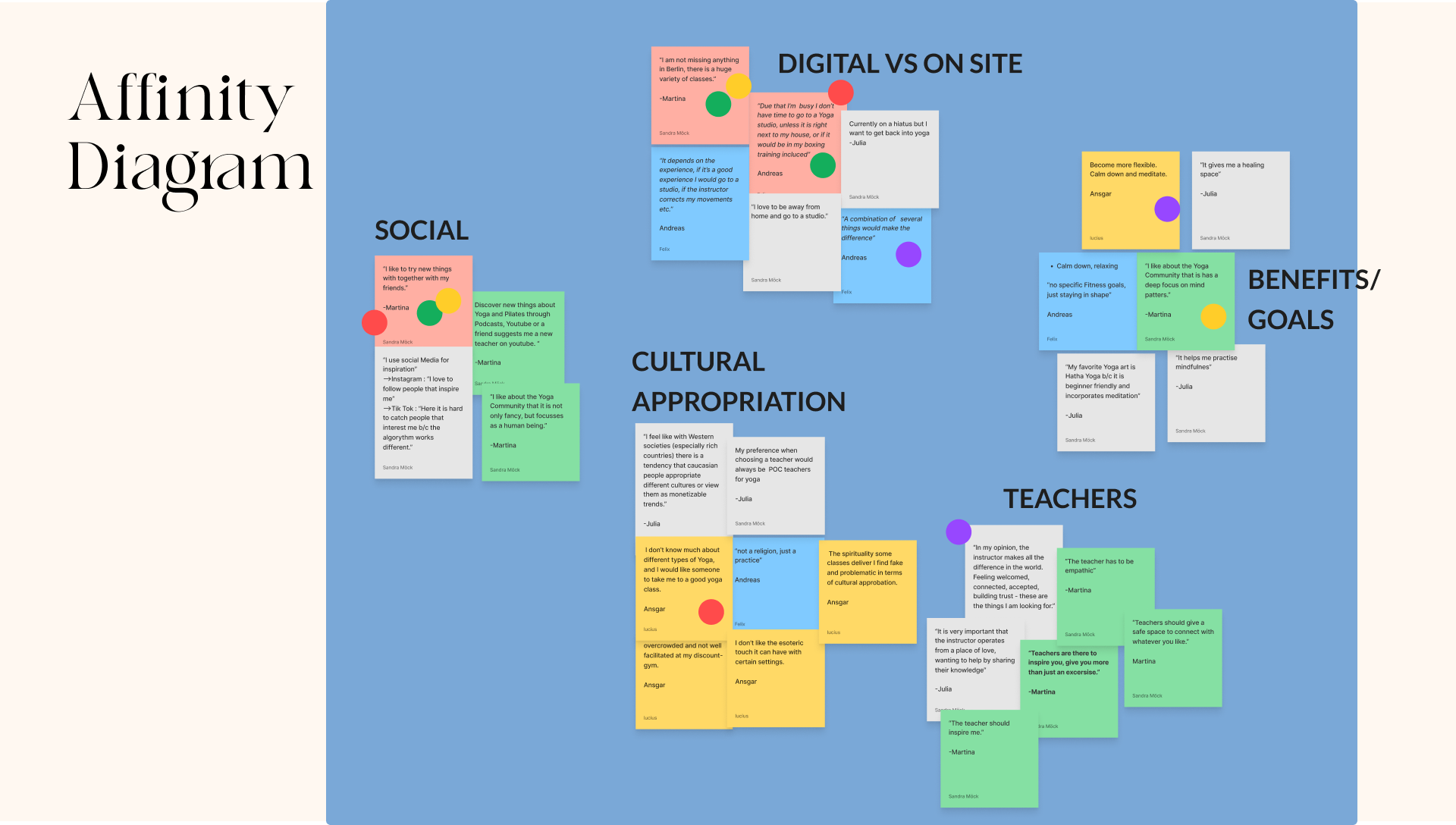
During the user interviews for our UX/UI project on Body Unity, we gained valuable insights that helped us understand the users’ needs and expectations.
To organize and analyze the data gathered from the interviews, we created an Affinity Diagram. This diagram allowed us to categorize and sort the results into five distinct categories. Let’s take a closer look at some of the quotes and feedback we received from the users in each category:
To organize and analyze the data gathered from the interviews, we created an Affinity Diagram. This diagram allowed us to categorize and sort the results into five distinct categories. Let’s take a closer look at some of the quotes and feedback we received from the users in each category:
Empathy Map
After creating the Affinity Diagram, we continued our UX/UI project by utilizing an Empathy Map. The Empathy Map allowed us to dive deeper into understanding the users’ thoughts, feelings, needs, and motivations. By empathizing with the users, we aimed to gain a holistic understanding of their experiences.
User Persona
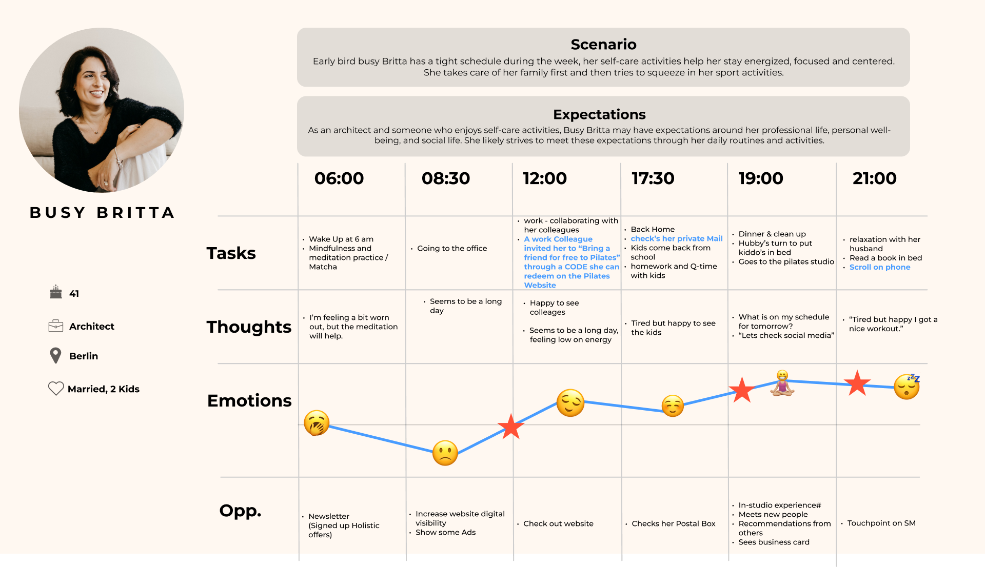
Let me introduce you to Busy Brita, our finalized User Persona for the Body Unity app. Busy Brita is a persona we have developed after engaging in a thorough group discussion, representing a significant user segment. She leads a hectic lifestyle, juggling multiple responsibilities and experiencing high levels of stress. Busy Brita’s primary goal is to find suitable yoga and Pilates classes that are conveniently located near her.
User Journey Map
The User Journey Map of Busy Brita reveals several opportunities to enhance her experience with the Body Unity app. Let’s explore the different stages of her journey:

Moodboards
Site Map

final moodboard
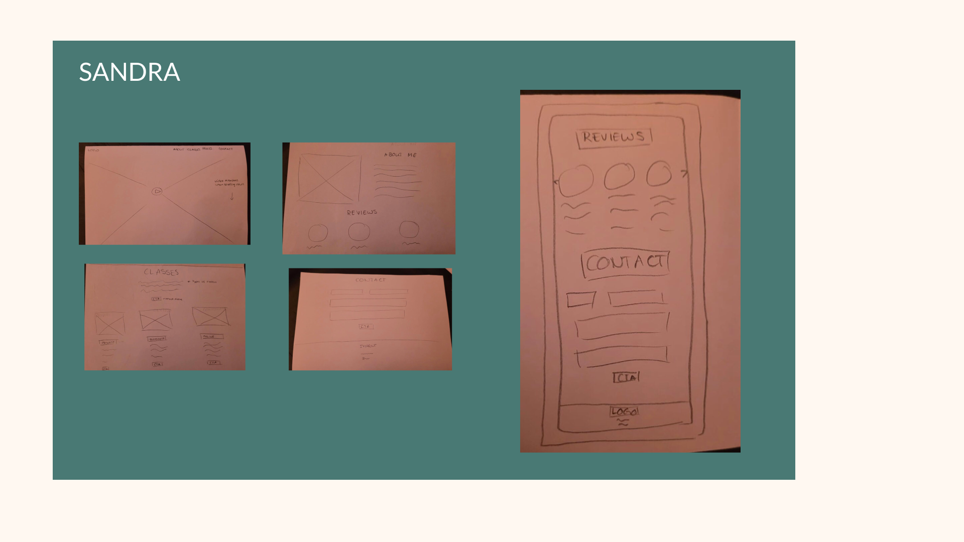
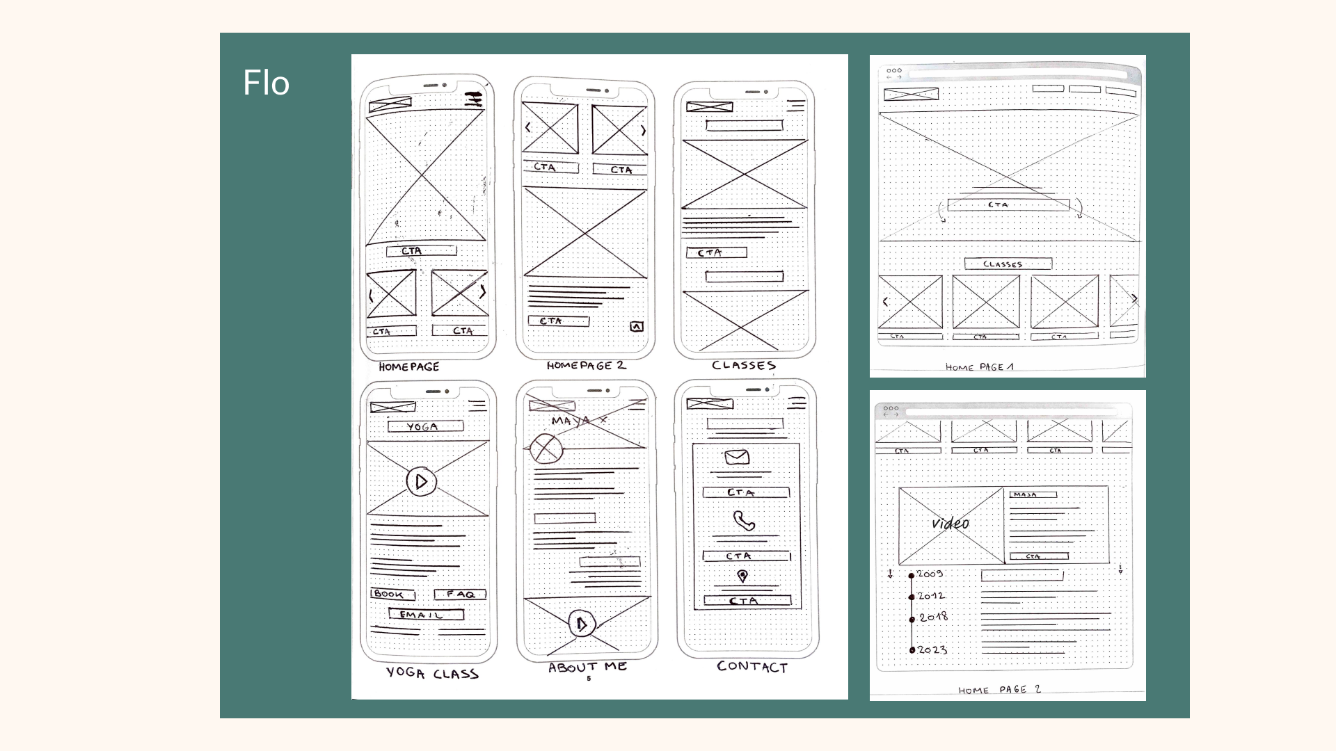
Concept Sketches
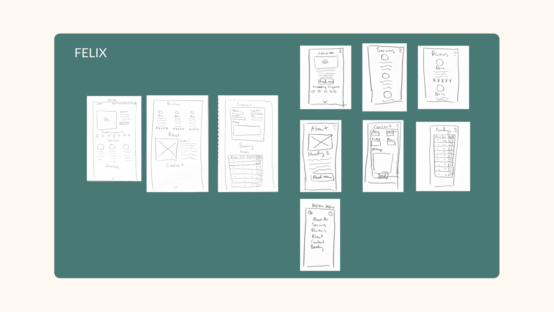
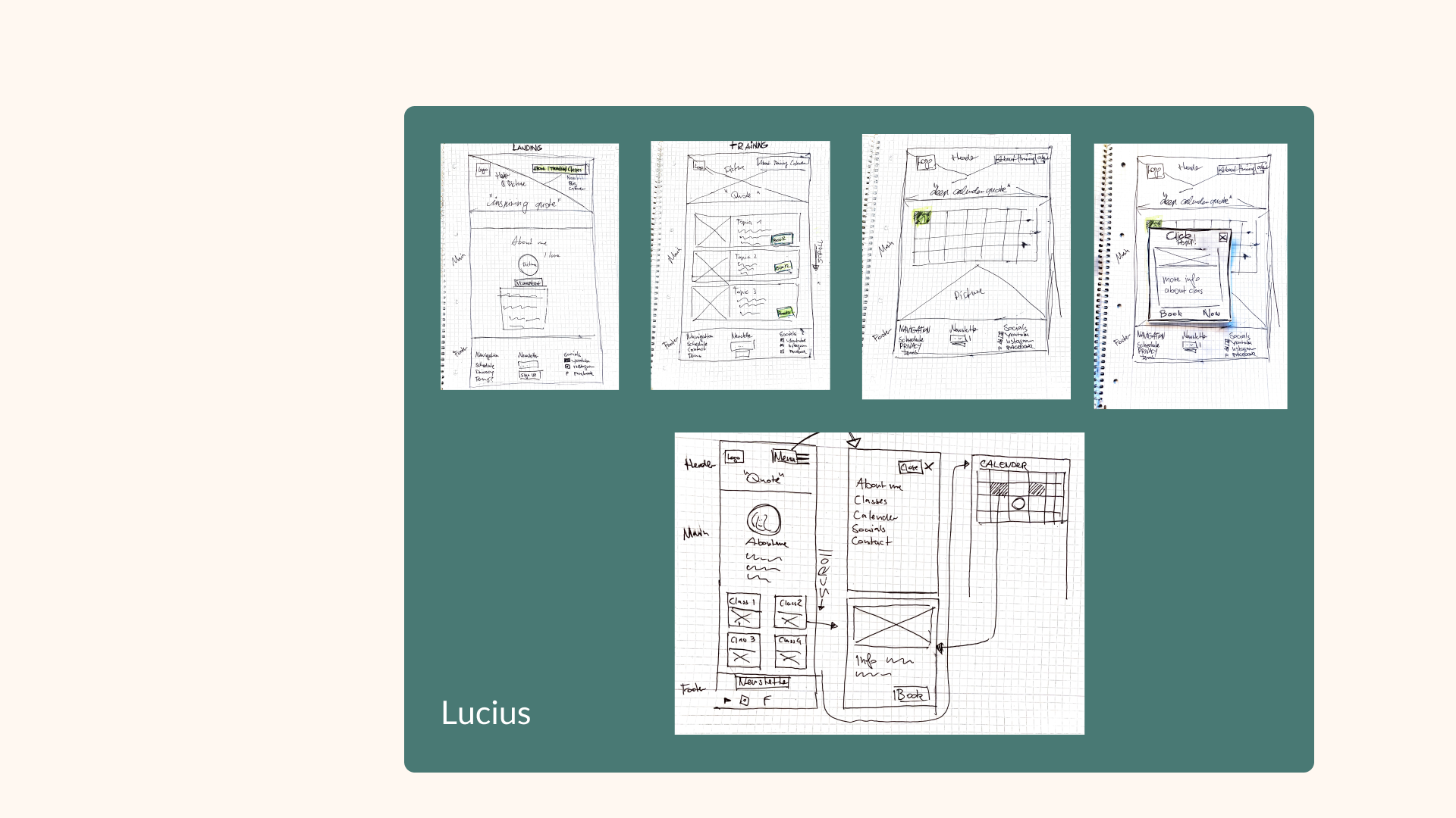
During the concept sketching phase, each team member took the initiative to create low-fidelity prototypes. We invite you to review our prototypes and provide valuable feedback to help us enhance our designs.

Mid-Fidelity
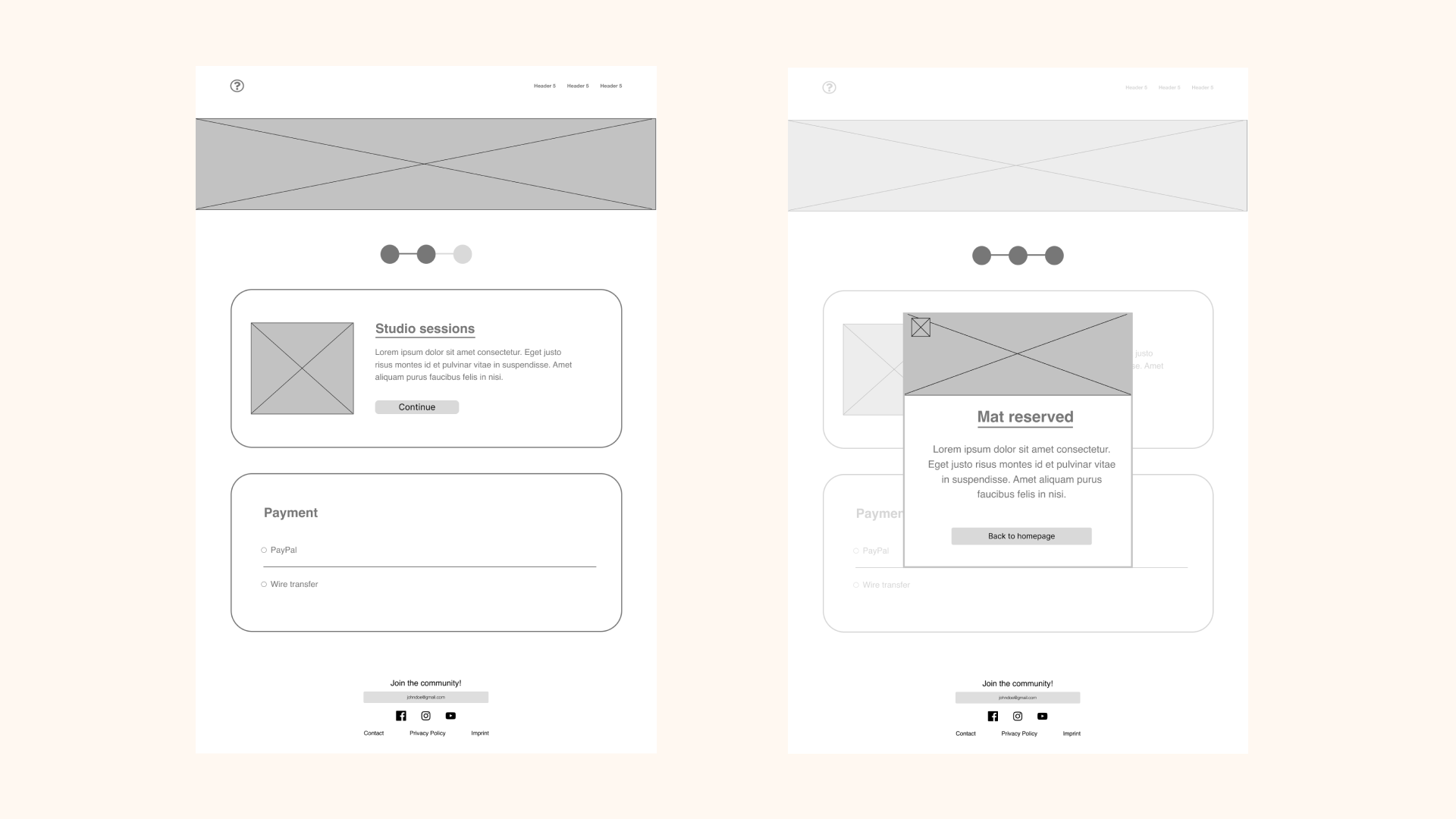
In our mid-fidelity prototype, our main objective was to prioritize user convenience and provide a seamless experience for browsing and booking classes.
We focused on offering essential details such as class location, difficulty level, and pricing, allowing users to make informed decisions quickly. Additionally, we emphasized introducing the Yoga and Pilates Trainer to establish a personal connection with the users. To build trust, we showcased the trainer’s affiliation with reputable companies or organizations.
We focused on offering essential details such as class location, difficulty level, and pricing, allowing users to make informed decisions quickly. Additionally, we emphasized introducing the Yoga and Pilates Trainer to establish a personal connection with the users. To build trust, we showcased the trainer’s affiliation with reputable companies or organizations.
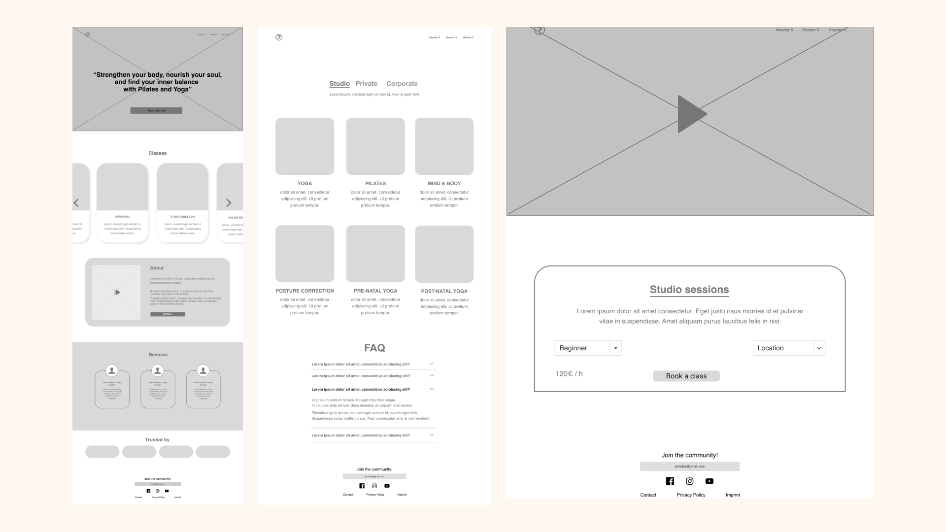
To address potential user queries, we incorporated a comprehensive FAQ section, ensuring that users can find immediate answers to common questions without any additional hassle.
The class booking process was designed to be straightforward and accessible. Users can easily choose their preferred time slot and book the class directly on the website, eliminating any unnecessary steps or complications.
The class booking process was designed to be straightforward and accessible. Users can easily choose their preferred time slot and book the class directly on the website, eliminating any unnecessary steps or complications.
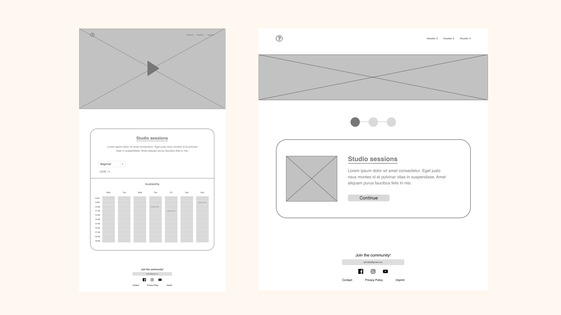
By prioritizing user-friendliness, providing important class details, introducing the trainer, establishing trust through affiliations, and incorporating a helpful FAQ section, we aimed to create a mid-fidelity prototype that streamlines the class browsing and booking process, ensuring a seamless and enjoyable user experience.
Usability Testing
During the usability testing phase, we received valuable feedback from users, which helped us enhance the overall user experience. One notable improvement suggested by users was the integration of a calendar feature. This feature allows users to conveniently export class details directly into their personal calendars, enabling them to keep track of their scheduled classes effortlessly.
Another suggestion from users was to introduce discount options for class packages. This addition provides users with cost-effective options and incentives to attend multiple classes, promoting user engagement and loyalty.
Another suggestion from users was to introduce discount options for class packages. This addition provides users with cost-effective options and incentives to attend multiple classes, promoting user engagement and loyalty.
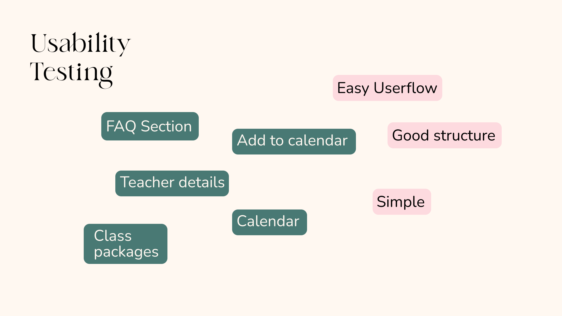
Users also expressed appreciation for the inclusion of detailed information about the teachers. By providing insights into the background, qualifications, and expertise of the instructors, users felt more confident and informed when selecting their preferred classes.
To address common user questions and concerns, we implemented a comprehensive FAQ section. Users found this feature helpful, as it provided immediate answers and eliminated the need for additional support or assistance.
Furthermore, users praised the well-structured and intuitive layout of the page. The simplicity of the design and the seamless user flow contributed to a positive user experience, making it easy and enjoyable for users to navigate and interact with the platform.
Taking into account the valuable feedback from users, we have successfully implemented enhancements such as calendar integration, discount options, detailed teacher information, an informative FAQ section, and an intuitive user interface. These improvements aim to create a user-centric platform that offers convenience, transparency, and a seamless experience for all users.
Moodboard
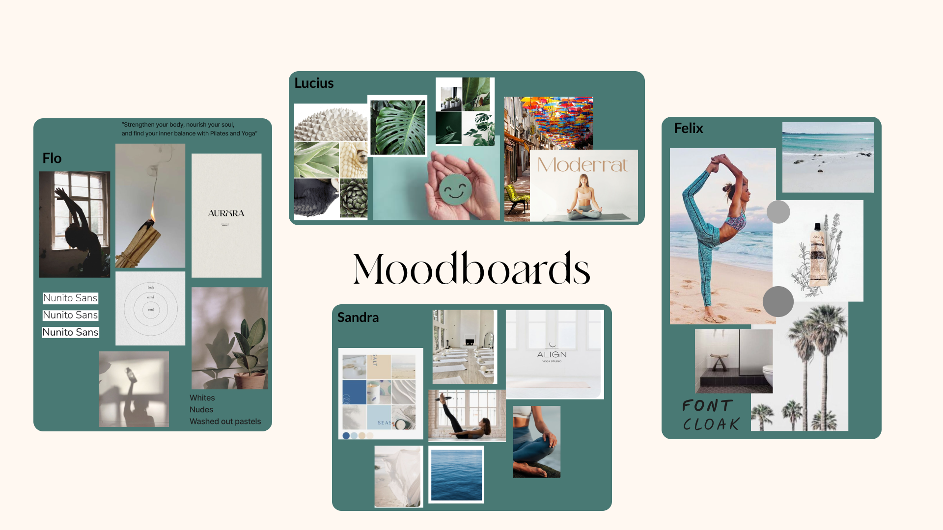
During our collaborative process, each group member created a moodboard to capture their individual vision and ideas. This allowed us to assess whether we were aligned and working towards a common goal. We carefully reviewed and analyzed each moodboard, extracting the most compelling and relevant elements from each one.

Through this collaborative effort, we consolidated our ideas and inspiration into a final moodboard that represents our shared vision and sets the direction for our project.
Final Moodboard
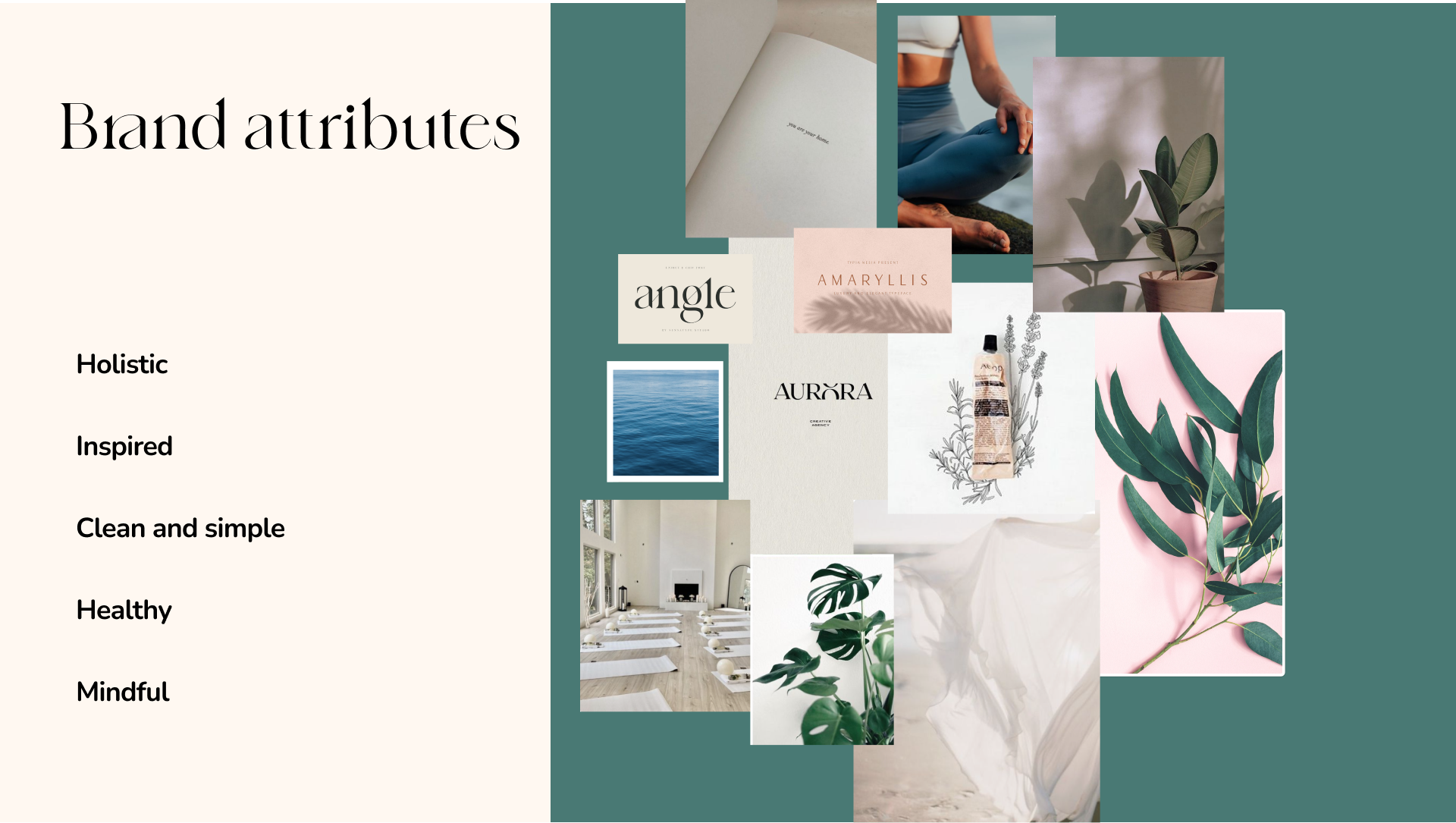
Here is our final moldboard including our Brand attributes, which encapsulates the essence of our project.

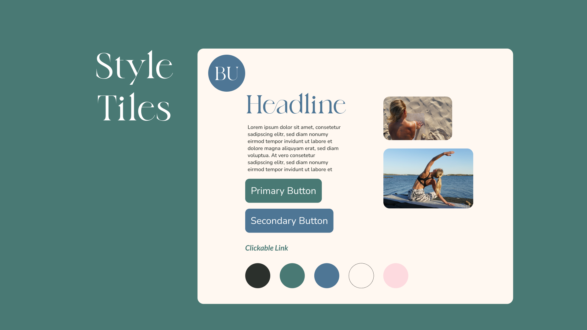
Style Tile
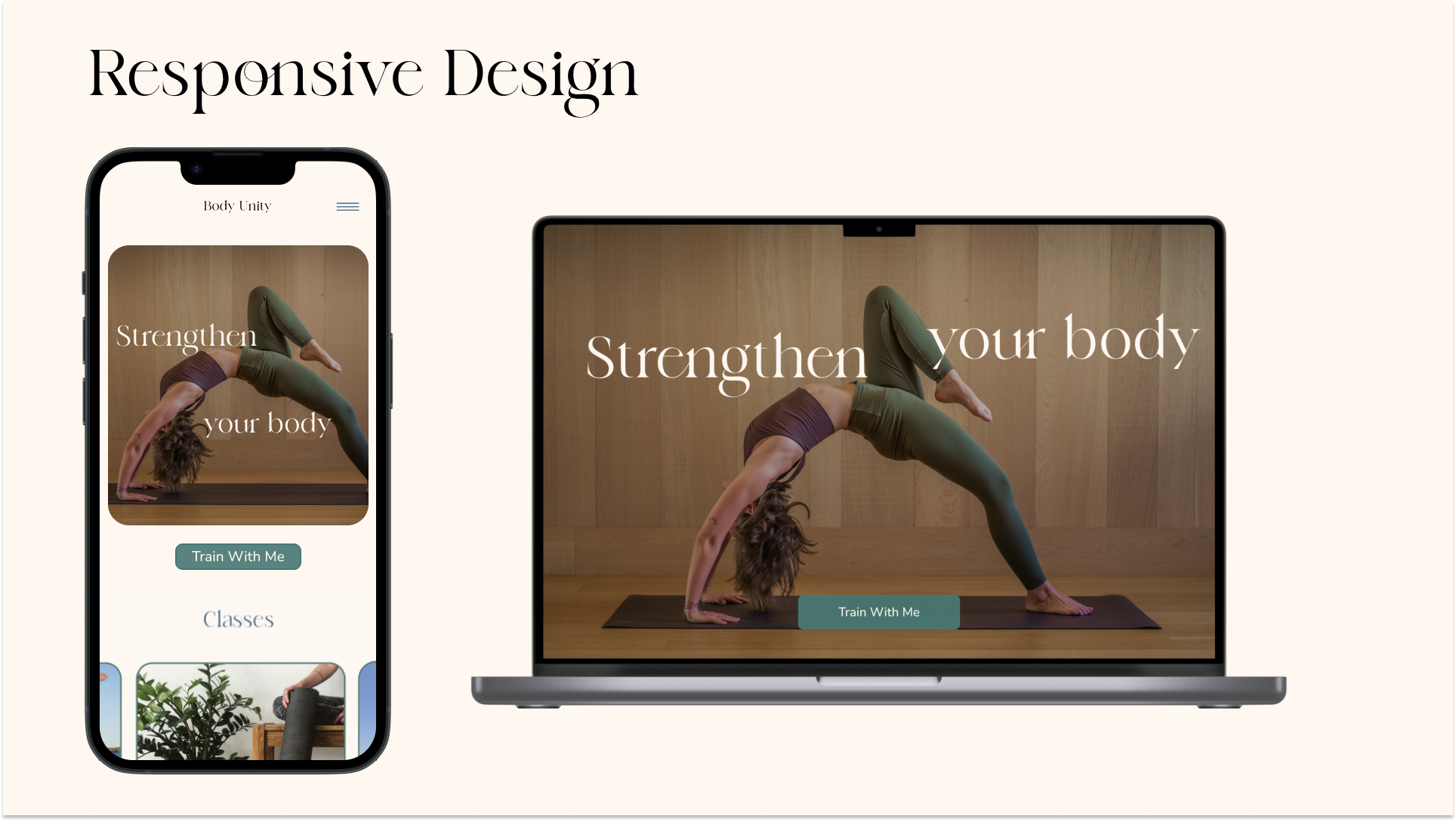
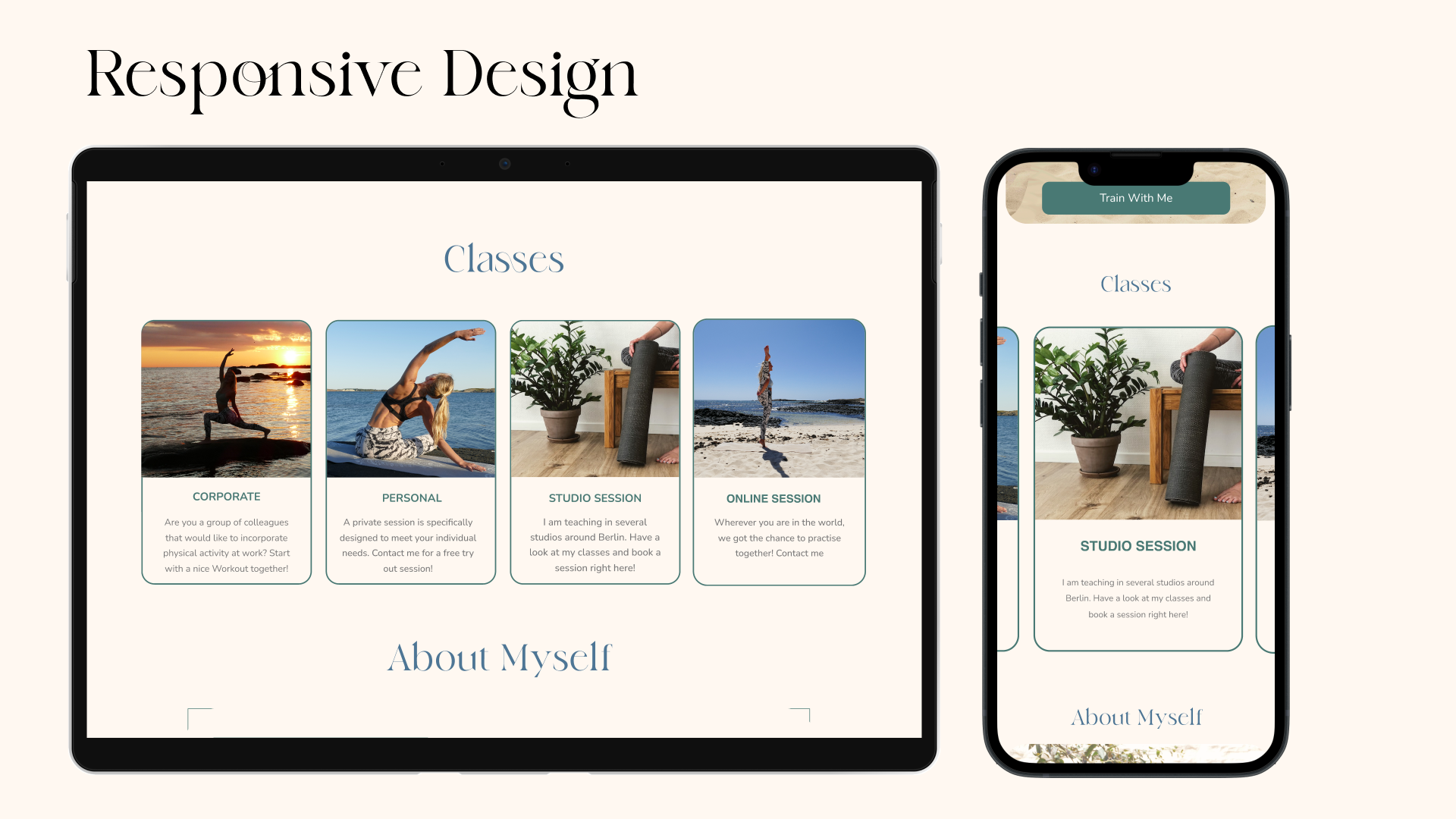
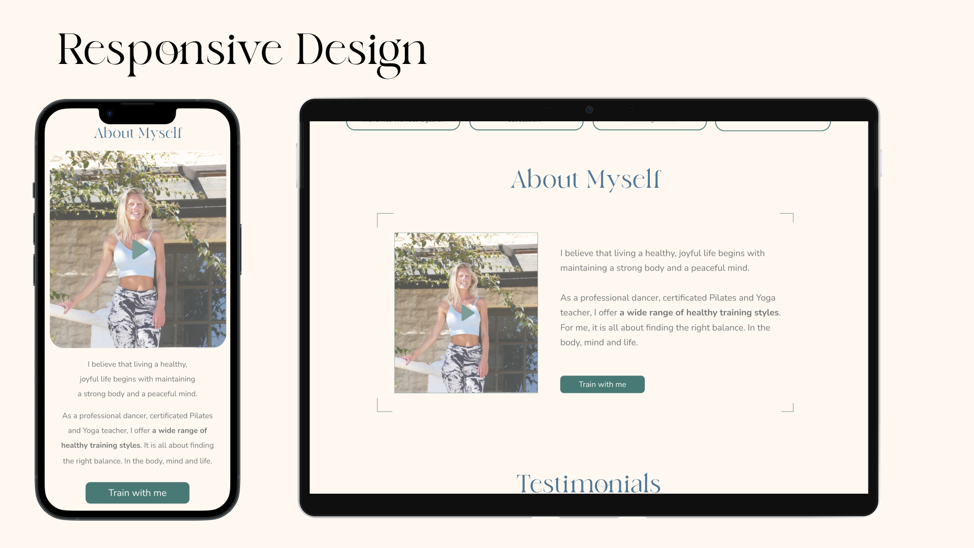
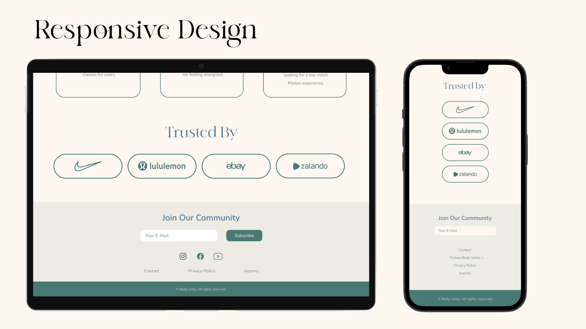
Responsive Design
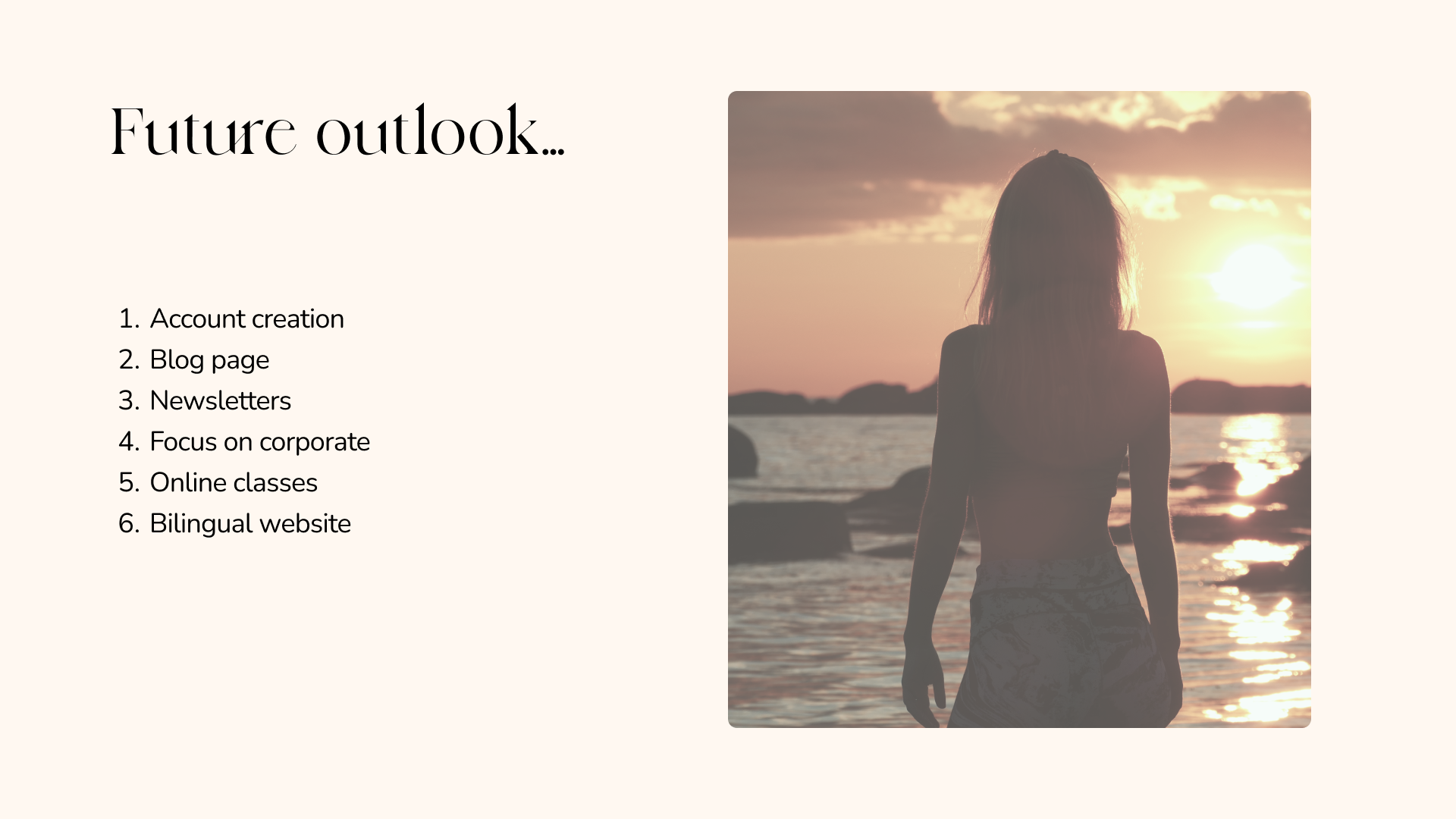
Potential next steps
Key Learnings
Throughout this project, I gained valuable insights and learned important lessons that have contributed to my personal and professional growth. Here are some key learnings I took away from this experience:
- The Art of Compromise: One of the most significant learnings for me was the importance of compromise. As a team member with my own ideas and design concepts, I realized the need to find common ground and be willing to compromise. It taught me the value of considering different perspectives and finding solutions that satisfy the needs and preferences of everyone involved.
- Active Listening and Collaboration: This project emphasized the significance of active listening and effective collaboration. I learned the importance of creating an environment where everyone’s ideas are respected and given due consideration. By actively listening to my teammates, we fostered a culture of open communication and collaboration, which led to better outcomes and a stronger team dynamic.
- Embracing Diverse Perspectives: This experience taught me the power of embracing diverse perspectives. Each team member brought unique skills and insights to the table, and by embracing this diversity, we were able to explore a wider range of creative solutions. I learned to appreciate the value of different viewpoints and the positive impact they can have on the quality of our work.
- Flexibility and Adaptability: Throughout the project, I realized the importance of flexibility and adaptability in the design process. As we encountered challenges or received feedback, I had to be open to making adjustments and iterating on my designs. This flexibility allowed me to improve and refine my work based on new insights and changing requirements.
- Balancing User Needs and Design Vision: One of the key challenges I faced was striking a balance between user needs and my design vision. I learned that while it is crucial to listen to user feedback and address their needs, it is equally important to maintain a cohesive design vision that aligns with the project goals. This experience taught me how to navigate this balance and make informed design decisions that consider both user requirements and the overall design vision.
By embracing the art of compromise, actively listening and collaborating, embracing diverse perspectives, being flexible and adaptable, and balancing user needs with design vision, I have grown both professionally and personally. These key learnings will undoubtedly shape my future endeavors, enabling me to create even more successful and user-centered experiences.
Thank you for reading!
Click here to read the Full Article
Thank you for reading!
Click here to read the Full Article
MORE infos
Email me if you want to learn more